1. I chose one because it’s most visually appealing and captivating, it’s more aesthetically pleasing and eye catching.
4. seems to have more focus to the couple in love
5. I like that a couple is centered and immediately there is a privacy settings button.
6. Seems more colorful/vibrant. Shows happy couple whereas the other one doesn't.
8. It seems more serious because there is just a couple in a romantic environment.
11. It shows a couple in love and is more personal than Option 2. Option 2 resembles more the gathering of a group of friends.
12. the profile look like a dating one
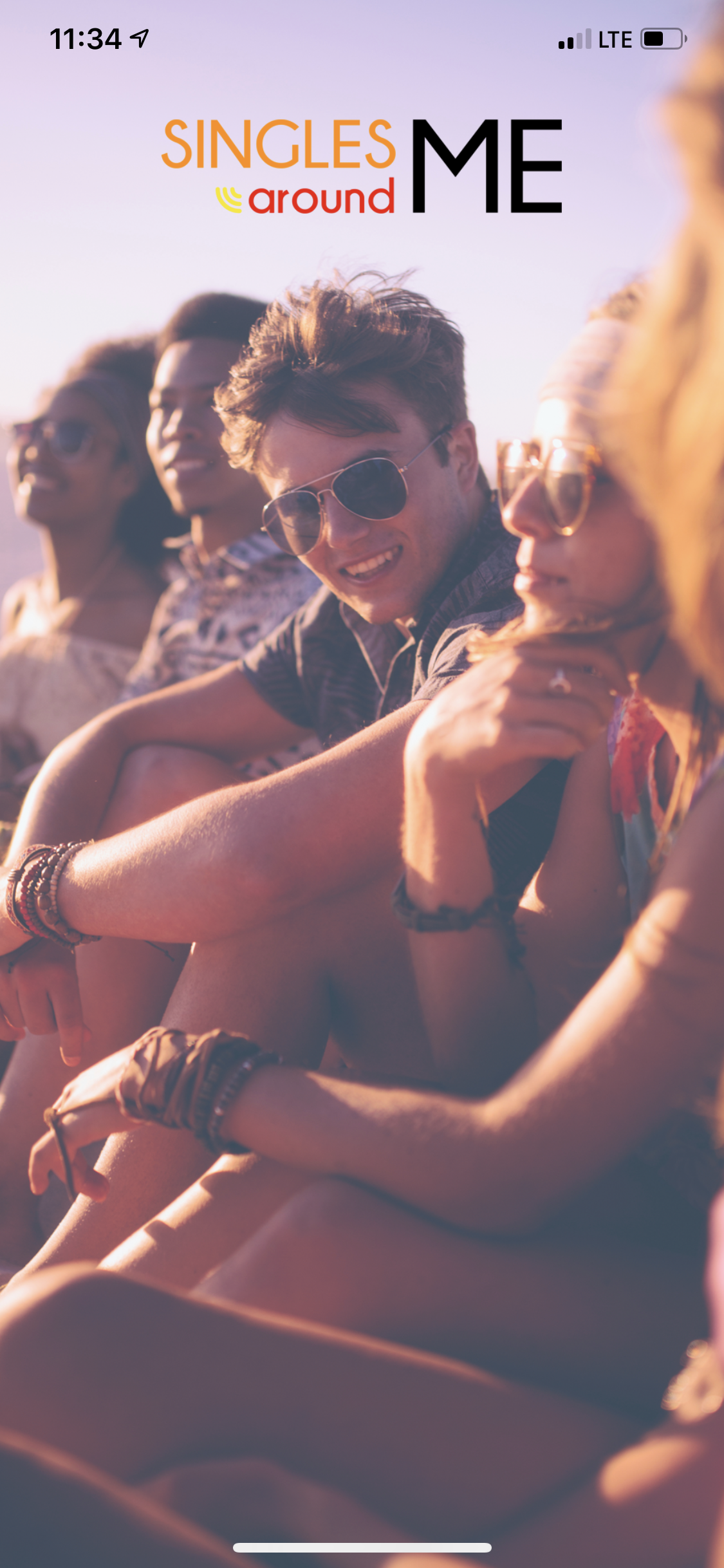
13. agree
14. its very nice
16. The location is privacy so like that
17. The image is very romantic. It gives a sense of finding a long-term relationship with someone you love.
18. It is more aesthetically pleasing and I personally dislike opening screen that feature just a picture and no options.
20. love is temporary but single is permanent
22. It looks very attractive to dating app
23. ITS PRIVACY OPTION I LIKE THAT
25. It is nice look and best image
28. i like this picture
30. very attractive
31. love
34. I think it looks more intimate. That is something one would go for in a dating app in my opinion.
35. It is more consistent with and demonstrative of what one would expect in a dating app.
38. romance
39. Crisp clear picture...heart shaped balloons caught my eye
40. On seeing this image one can identify this app is for dating whereas the option 2 is more a social media friends group app.
41. none
42. THE FIRST IMAGE IS BETTER
43. It is good dating app.
44. It basically makes it obvious that it is a dating app
45. very glarity
48. LOVE
49. OPTION 1
50. As I further developed my abilities- I decided to pursue a career in the field. I'm now looking for a job where I can apply the programming skills I already have and develop new ones- too. I chose this career because I love working with computers- so I want to continue improving my abilities in doing so. 2.
18 Responses to Option B
18 people chose B as their choice
2. cleaner look
3. it looks more sensual and inviting
7. Singles always happy
9. It has better colors and it seems like the people are on holiday whereas, in the first one, they are just on a random street which is not very romantic.
10. Option 2 is much more casual and care free. I like that it just shows people hanging out and having fun. That is how you meet people and build connections. Option 1, on the other hand, shows a romantic connection right away, which is a bit too much pressure. I prefer the more laid back, casual approach.
15. it was looking more trendy
19. super
21. Less cluttered overall
24. It looks much more intimate and like a relationship thing.
26. Like option 2 better having a more casual background for not having much going on onscreen
27. Option 2 appears more fun and lively. There is less pressure and more focus on having fun than the other splash screen.
29. PHOTE VER NICE
32. look okay
33. It symbolizes the name of the app.
36. I like This
37. capturing mode is super
46. ITS so clear and attractive
47. When compare to one second app i like more so only
Demographics
Manage pending orders and track invoices.
Age Range (Personal)
Share Your Results
Anyone with the following URL can see these poll results.